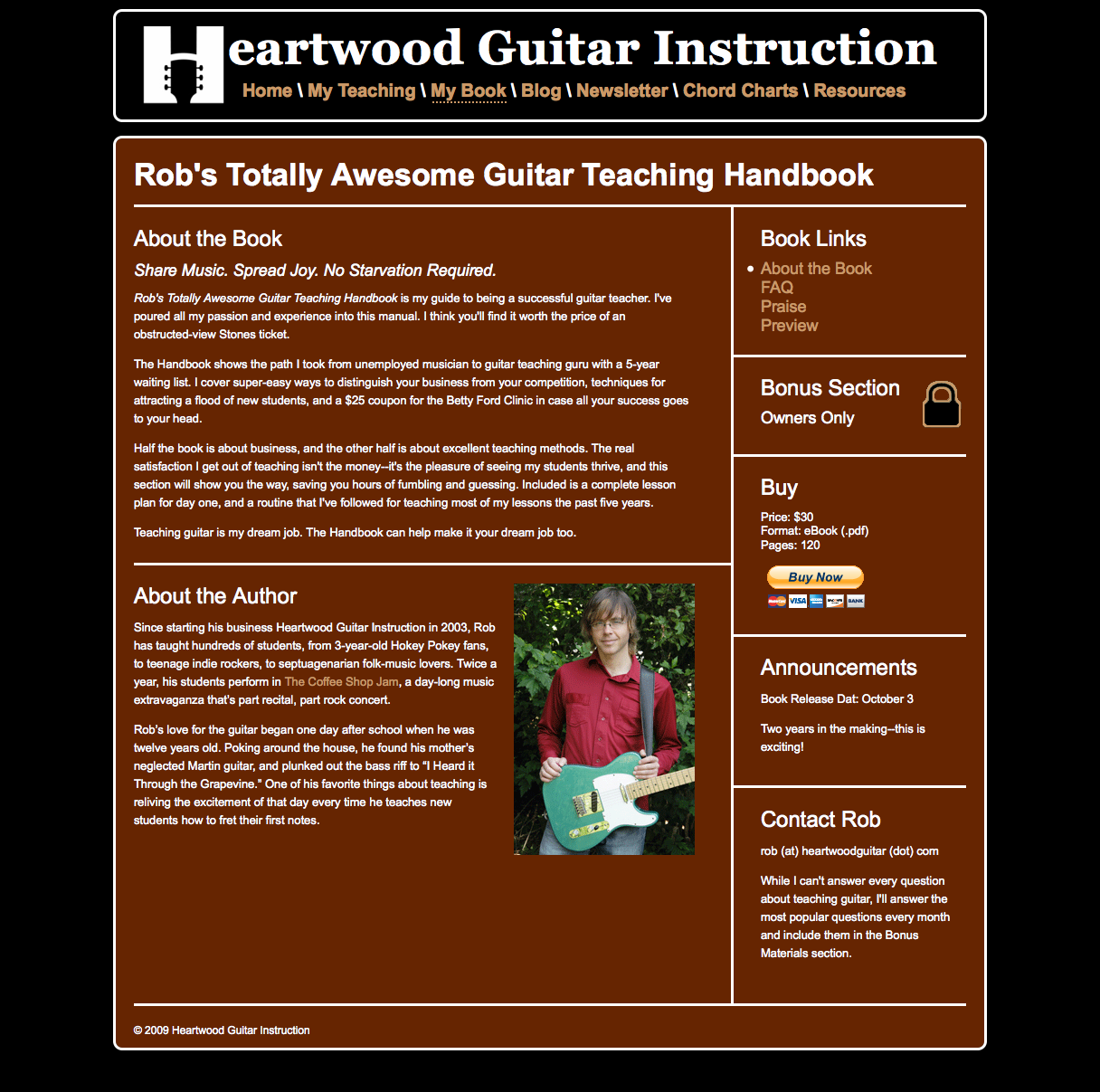
Hi Rob. The new site design is looking good. The only comment I would make is that the 'About the Book' section is written in first person (I have written etc.) whilst the 'About the Author' section is in third person (Rob has written etc.)
Thanks for bringing up this issue--I've been conflicted about it. Typically bio's are in 3rd person--it's easier to write about all your amazing accomplishments without sounding like an egomaniac. But I'm sure I want the rest of the copy to be in a personable, friendly first person. Anyone have thoughts on this?
White text on brown isn't a good look man. Small sections of text like this aren't so bad, but not really for a blog or a website with a fair bit of writing. Honestly, I'd stick with a dark coloured text on a light coloured background. Your logo is pretty smart, but don't let it get too corporate!
It looks good. My one comment is that I hope the top banner and links carry over to all the pages. Right now, if I find one of you chord pages on Google and follow it, there is no easy or intuitive way to get back to the blog.
Nice design, though I agree with the previous poster who said that black text on a white background is easiest on the eyes.
Thanks Jody and Tyler. Tyler, yes--one of the main things I wanted to do in this redesign is have one navigation bar for all pages on the site. I may not pull of installing it on the blog, but I do want to put it on all song pages.
And thank you for your comments about the text/background colors. For the whole life of the site white-on-brown has been it's "look." It's hard to imagine it any other way. But I'm doing my best.

Comments 8
haha looks totally awesome!!
Hi Rob. The new site design is looking good. The only comment I would make is that the 'About the Book' section is written in first person (I have written etc.) whilst the 'About the Author' section is in third person (Rob has written etc.)
Hi Pete,
Thanks for bringing up this issue--I've been conflicted about it. Typically bio's are in 3rd person--it's easier to write about all your amazing accomplishments without sounding like an egomaniac. But I'm sure I want the rest of the copy to be in a personable, friendly first person. Anyone have thoughts on this?
Rob
White text on brown isn't a good look man. Small sections of text like this aren't so bad, but not really for a blog or a website with a fair bit of writing. Honestly, I'd stick with a dark coloured text on a light coloured background. Your logo is pretty smart, but don't let it get too corporate!
It looks good. My one comment is that I hope the top banner and links carry over to all the pages. Right now, if I find one of you chord pages on Google and follow it, there is no easy or intuitive way to get back to the blog.
Nice design, though I agree with the previous poster who said that black text on a white background is easiest on the eyes.
Thanks Jody and Tyler. Tyler, yes--one of the main things I wanted to do in this redesign is have one navigation bar for all pages on the site. I may not pull of installing it on the blog, but I do want to put it on all song pages.
And thank you for your comments about the text/background colors. For the whole life of the site white-on-brown has been it's "look." It's hard to imagine it any other way. But I'm doing my best.
Yes really it looks great...
looks good, nice logo..:)